Grid
Use grid layouts to guide your designs based on different screen sizes. Design for small screens first and prioritize content readability.
Layout grids
Breakpoints and grid styles
A breakpoint is the threshold at which the website’s layout changes to maintain a good user experience. In responsive design, a breakpoint range indicates the most appropriate number of columns for that viewport size, plus recommended widths for margins and gutters.
Our grid aligns to three breakpoints. Once a viewport exceeds 1440 px in width, only the margins will scale.
NOTE: In the current version of the NYC Digital Design System, all content on the tablet layout grid inherits mobile styles for components, patterns, typography, and containers.


Fluid grid
Although responsive, fluid grids still use breakpoints to determine whether the layout needs to change between viewport sizes. The containers and text on pages have preset minimum and maximum sizes based on our priority viewports to ensure the best reading experience for users.
Example: Informational page
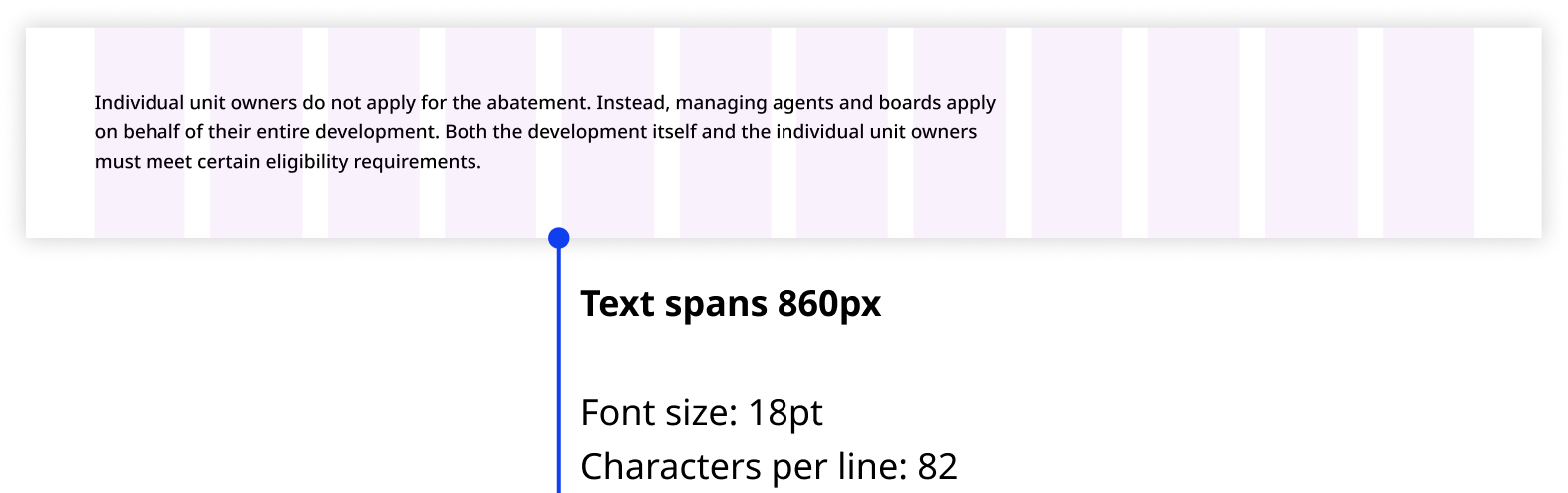
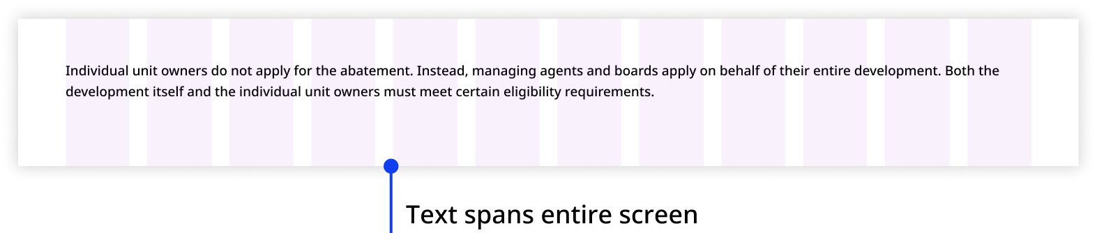
An informational page is typically dense with static content, so we prioritize the reading experience for users by shortening text line length on desktop and extending it on mobile.


Example: Form
You can be flexible with how containers and components occupy the grid in forms. However, we still recommend limiting your container and component widths to maintain content readability.

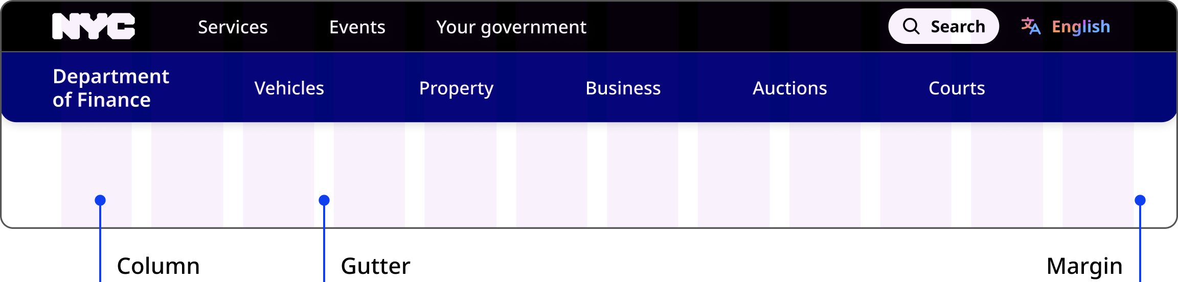
Grid anatomy
Elements
Columns divide the page into equal vertical sections and are used to organize content.
Gutters are the gaps between the columns. They separate content in a consistent way.
Margins define the outer edges of the grid. They prevent content from spilling past the viewable regions.
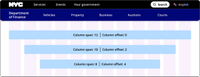
Column span and offset
Column span
Our grid has 12 columns for aligning content. Content should span across three or more columns, up to a maximum of 12. For flexibility, mix and match the number of columns used to unlock a variety of layouts across different breakpoints.
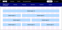
Column offset
Content does not need to span across all 12 columns. It can span a smaller number of columns, resulting in a layout with content centered on a 12 column grid.
We recommend not offsetting more than half the number of columns in each viewport, as that creates a visual imbalance of content (span) and negative space (offset). For example, do not offset seven of 12 columns on desktop, or five of eight columns on tablet.
Scaling text
The maximum line length for text elements is 80 characters or 750px.