Show more
Show more is one of two methods for browsing large libraries of content, along with pagination.
Overview
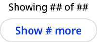
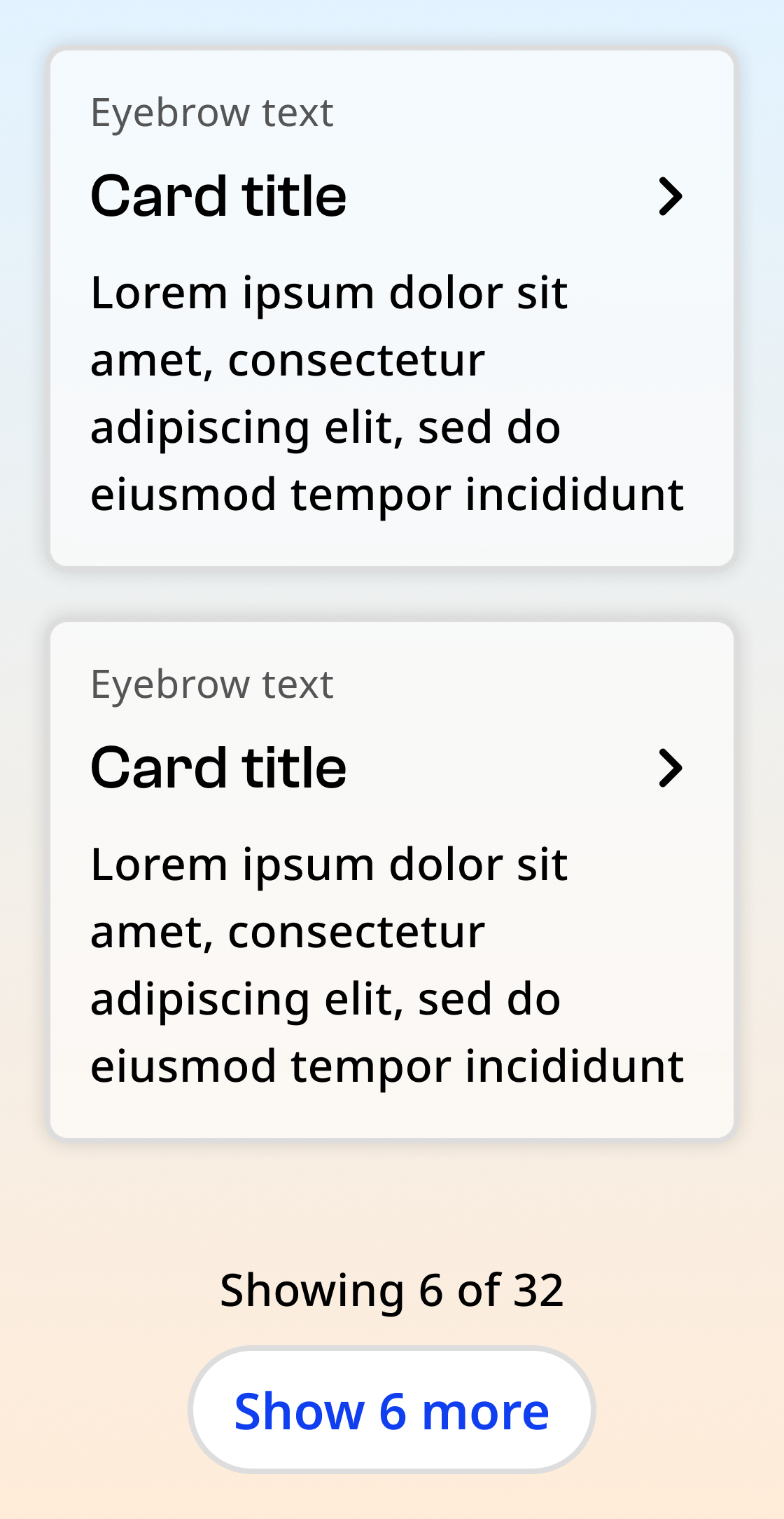
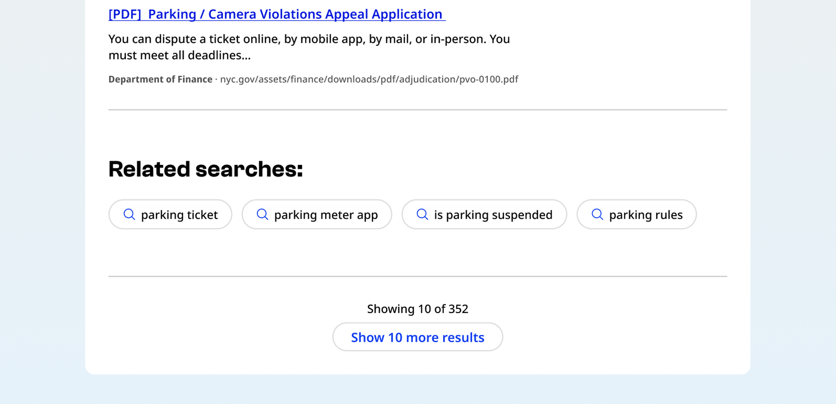
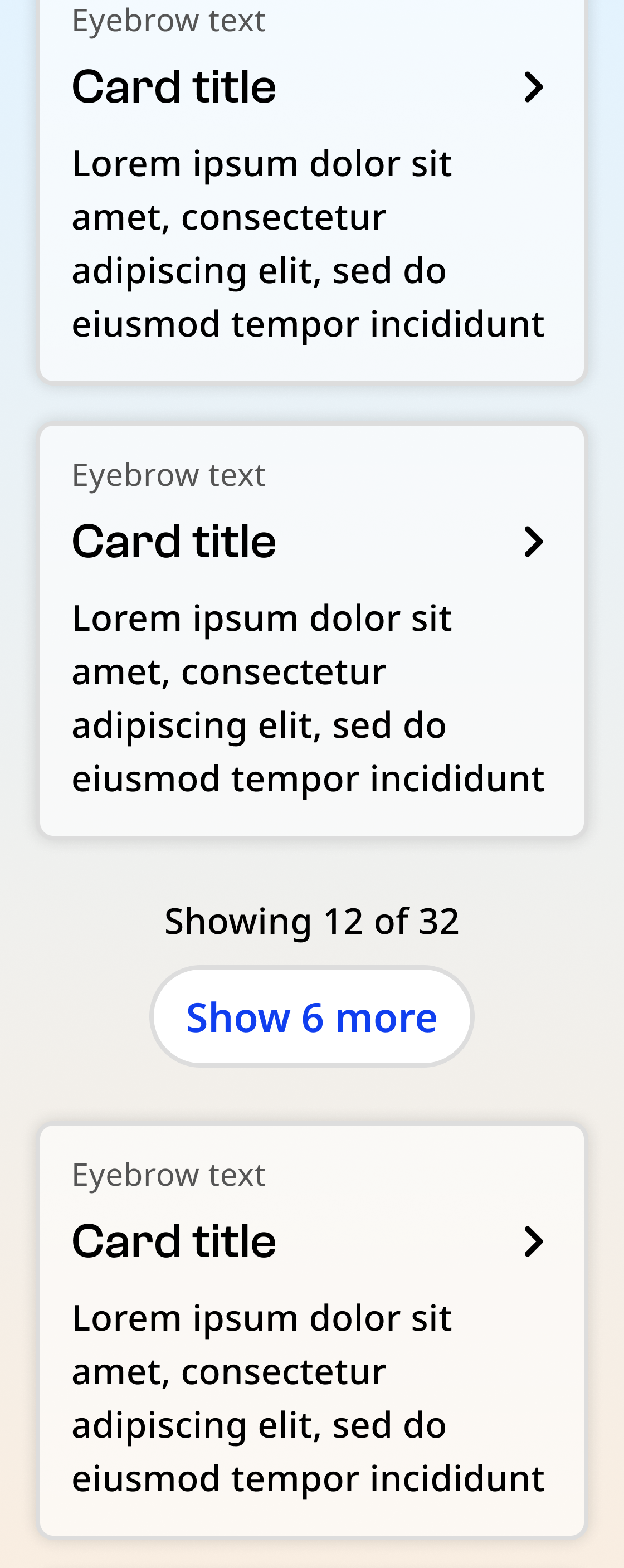
The show more component consists of a button and supporting text showing the number of currently displayed items and the total number of items.
Default
Hover

Focus

No more results
Usage context
When to use
Use the show more component for site areas where the user is more likely to be browsing or scanning content, rather than looking for one specific item. For example:
- Events
- News
- Search results
- Programs or benefits
- Resource libraries
You may also use show more rather than pagination if the page has robust search and filter capabilities.
When to use something else
Don’t use show more when the user is searching for a specific item in an alphabetical or chronological list. Use pagination instead. For example:
- Archives
- Large databases
- Lists of rules, laws, or proposals
- Large document libraries
Usage guidelines
Always place the show more component below all loaded content. After new content loads, the show more component should drop down to the bottom of the newly loaded content.
Show more
A show more component can be utilized with a nyc-show-more class container, with the following items:
- Body text:
p.nyc-show-more__text: Text indicating the number of currently displayed items and the total number of items, including: - Showing:
span[data-sm-count="showing"]: Indicating the number of currently displayed items - Total:
span[data-sm-count="total"]: Indicating the total number of items
- Showing:
- Button:
button.nyc-show-more__button: A secondary button, including: - Pagination count:
span[data-sm-count="pag"]: Indicating how many more items will be shown when clicked
- Pagination count:
Default
Showing 10 of 50 items
No more results
Showing 50 of 50 items
<div class="code-examples">

  <div>
    <h4>Default</h4>
    <div class="nyc-show-more">
      <p class="nyc-show-more__text">
        Showing <span data-sm-count="showing">10</span> of <span data-sm-count="total">50</span> items
      </p>
      <button class="nyc-button nyc-show-more__button" data-variant="secondary">
        Show <span data-sm-count="pag">#</span> more
      </button>
    </div>
  </div>

  <div>
    <h4>No more results</h4>
    <div class="nyc-show-more">
      <p class="nyc-show-more__text">
        Showing <span data-sm-count="showing">50</span> of <span data-sm-count="total">50</span> items
      </p>
      <button class="nyc-button nyc-show-more__button hidden" data-variant="secondary">
        Show <span data-sm-count="pag">#</span> more
      </button>
    </div>
  </div>

</div>