Drop-down select
A drop-down select component allows users to choose one option from a drop-down menu. Use this component for lists of two to 15 items. For larger lists, see combo-box.
Overview
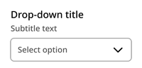
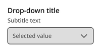
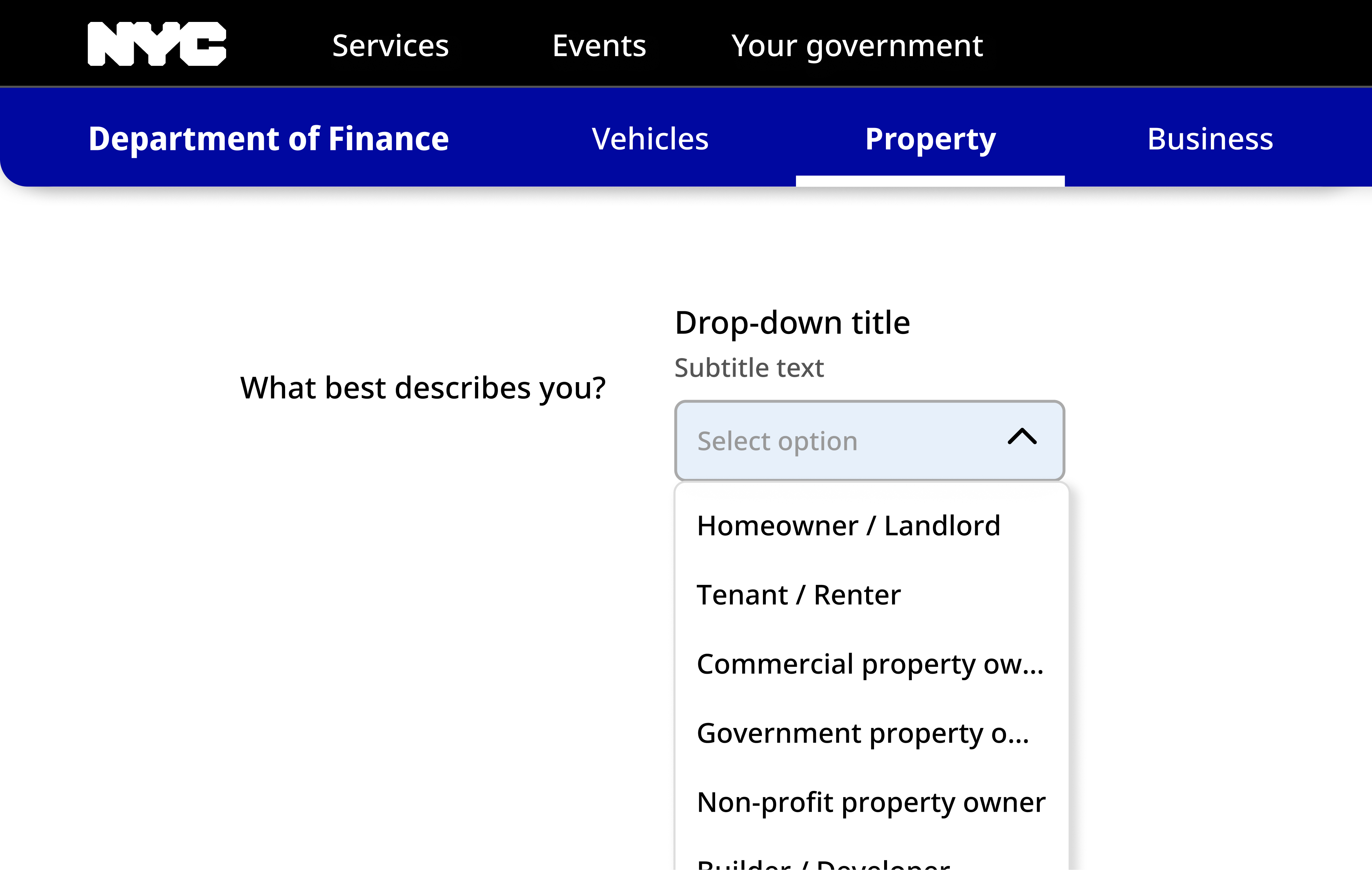
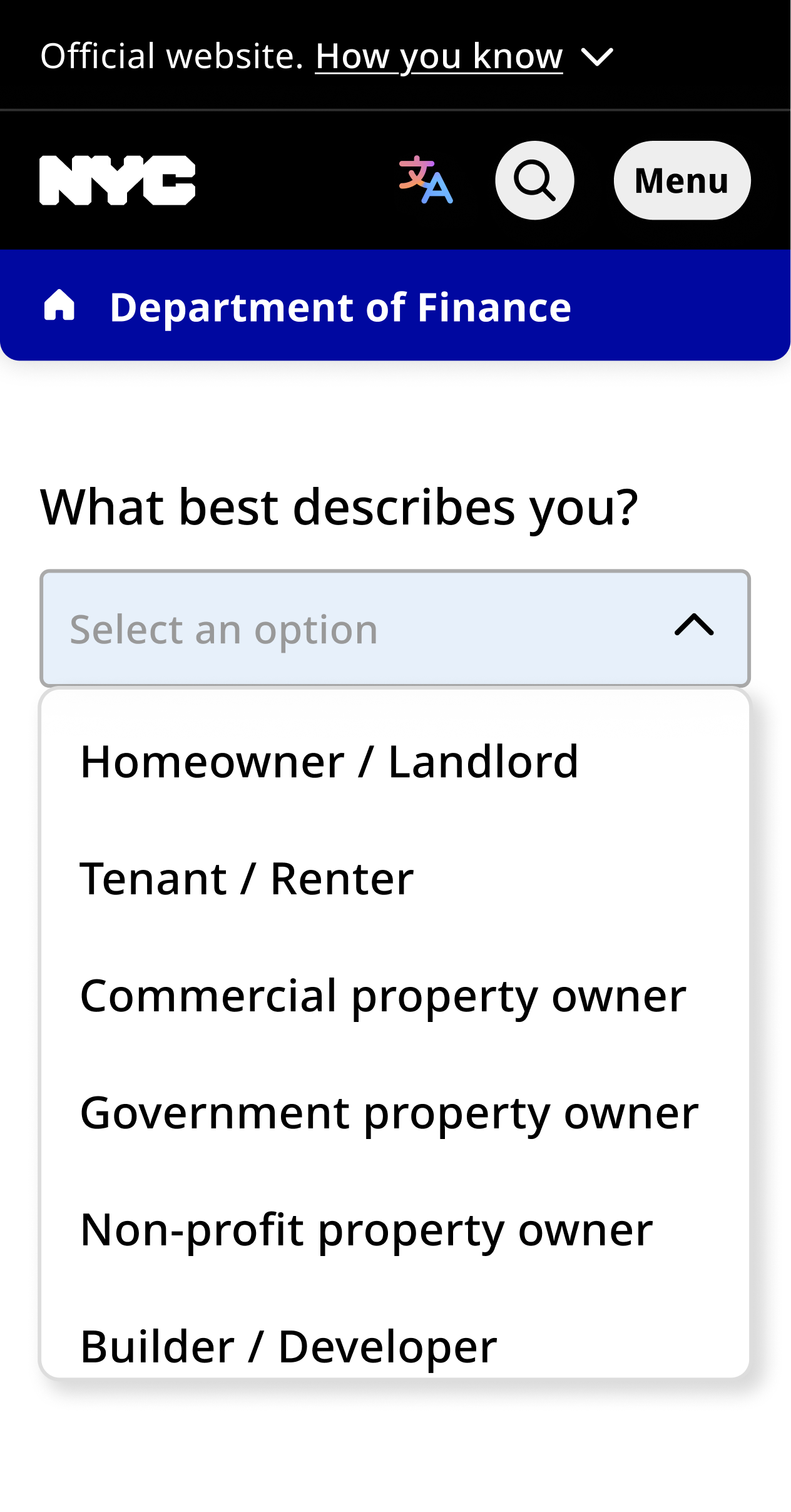
The component contains a title, optional subtitle, and drop-down container with up to 15 options.
Default
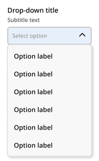
Opened
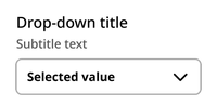
Selected
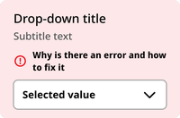
Error
Disabled
Usage context
When to use
Use the drop-down select component when the user is being asked to select just one item from a list of two to 15 items.
In general, favor drop-downs in contexts where space is limited. If you have space, use radio buttons for single-select experiences instead.
When to use something else
Don’t use the drop-down select component in the following situations:
- When there are only two options (use radio buttons instead)
- When the user is being asked to select one of a list of more than 15 options (use a combo-box instead)
- When the user is being asked to select more than one option from a list (use checkboxes instead)
Usage guidelines
The list modal appears below the select field when the user clicks. Only six options are shown at once, regardless of screen size.
Drop-down select
The dropdown component can be utilized with an nyc-field class container, with the following items:
- Label element: This acts as the button
- Select input element: Contained within the label
- Subtitle element (optional):
.subtitle: Provides additional context for the dropdown. This should be placed between the label and select elements.
This code is for reference only. The library is currently in beta. Check back for future releases.
<form class="code-examples">

  <div class="nyc-field">
    <label for="example-default-select">Default Dropdown Label</label>
    <span class="subtitle">Subtitle text</span>
    <select id="example-default-select">
      <option value="">-- Select option --</option>
      <option value="1">Option 1</option>
      <option value="2">Option 2</option>
      <option value="3">Option 3</option>
      <option value="4">Option 4</option>
      <option value="5">Option 5</option>
      <option value="6">Option 6</option>
      <option value="7">Option 7</option>
    </select>
  </div>

  <div class="nyc-field nyc-field--error">
    <label for="example-error-select">Error Dropdown Label</label>
    <span class="subtitle">Subtitle text</span>
    <div class="error-message"><i class="i-ph:warning-circle-bold"></i>This field is required.</div>
    <select id="example-error-select">
      <option value="">-- Select option --</option>
      <option value="1">Option 1</option>
    </select>
  </div>

  <div class="nyc-field">
    <label for="example-disabled-select">Disabled Dropdown Label</label>
    <span class="subtitle">Subtitle text</span>
    <select id="example-disabled-select" disabled>
      <option value="">-- Disabled --</option>
    </select>
  </div>

</form>