Error summary
Error summary is used at the top of any page containing input errors. It helps users understand the nature and number of errors so they don’t have to hunt for them.
Overview
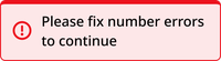
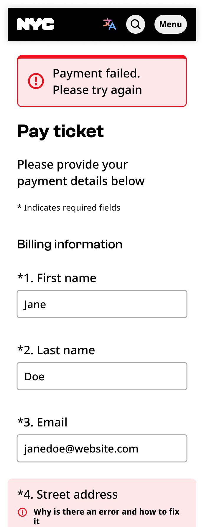
The error summary component includes a red banner, exclamation point icon, and a text container.
Desktop

Mobile
Usage context
When to use
Use an error summary at the top of any page containing errors that a user can take steps to fix, such as:
- Forms
- Payment processing
- Login
Only use an error summary after the user has submitted their inputs.
When to use something else
Don’t use an error summary in any of the following situations:
- Announcing a system outage or maintenance (use a banner instead)
- Announcing an error for a specific input (use the error variant of that input instead)
- Announcing anything prior to user input
Usage guidelines
Place the error summary at the top of the page that contains the errors.
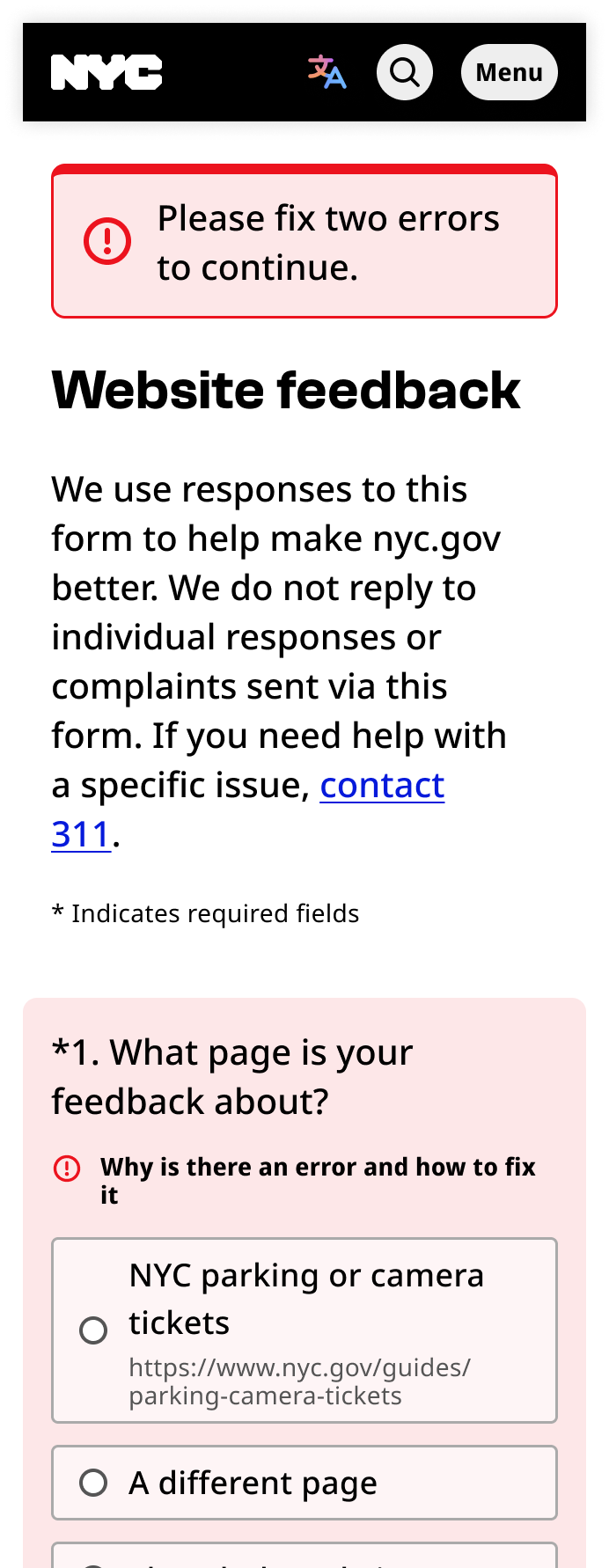
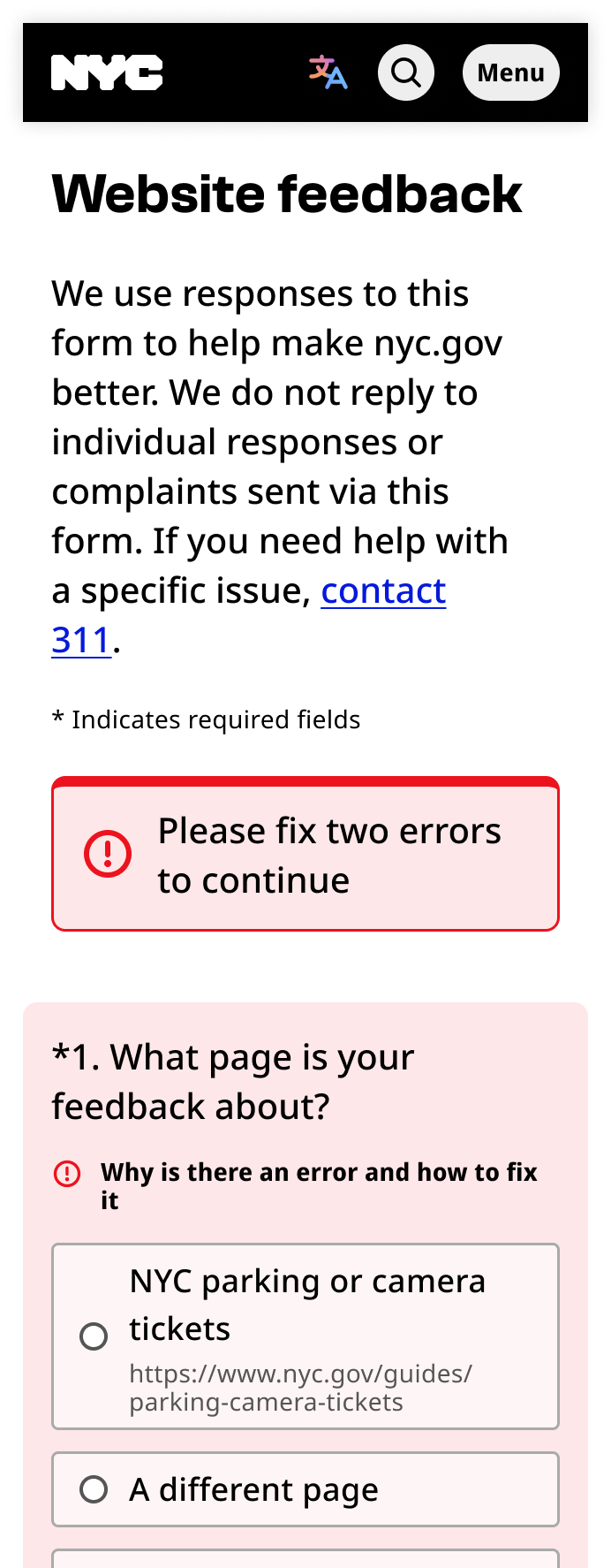
Error summaries can be used to state the number of errors on the page. You can also use the error summary to share details of an error that is not related to a specific input, such as a payment failure.

Error summary
The error summary component can be utilized with a banner-error class container, with the following items:
- Text element:
.field-text: This contains the error message text. - Icon element:
span.icon.i--exclamation
- Icon element:
<div class="field-group banner-error" tabindex="-1">
  <div class="field-text">
    <span class="icon i--exclamation"></span>
    4 error(s) found. Please fix all errors and try again.
  </div>
</div>