Spacing
Spacing is already defined in all components, patterns, and templates. In situations where spacing has not been clearly defined, refer to the usage guidelines here.
Group by similarity
When spacing elements on a page, those that are closer together are assumed to be related.
- Spacing within sections should be tighter, while spacing between different sections should be larger to help users differentiate them.
- Spacing between related components and content should be tighter to connect them.
Spacing between content
| Value (px) | Guidance | Example |
|---|---|---|
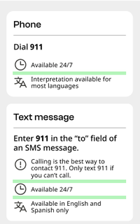
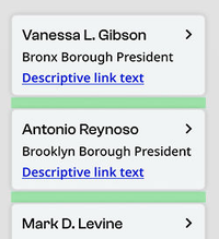
| 8 | Between a caption and its paired content (image or text), or between list items with icons | |
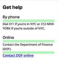
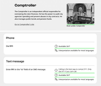
| 16 | Within a section, between headings H3/H4 and the following text or components (such as buttons or standalone links) | 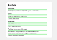 |
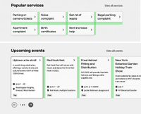
| 24 | Between components displayed in a list or grid |
|
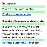
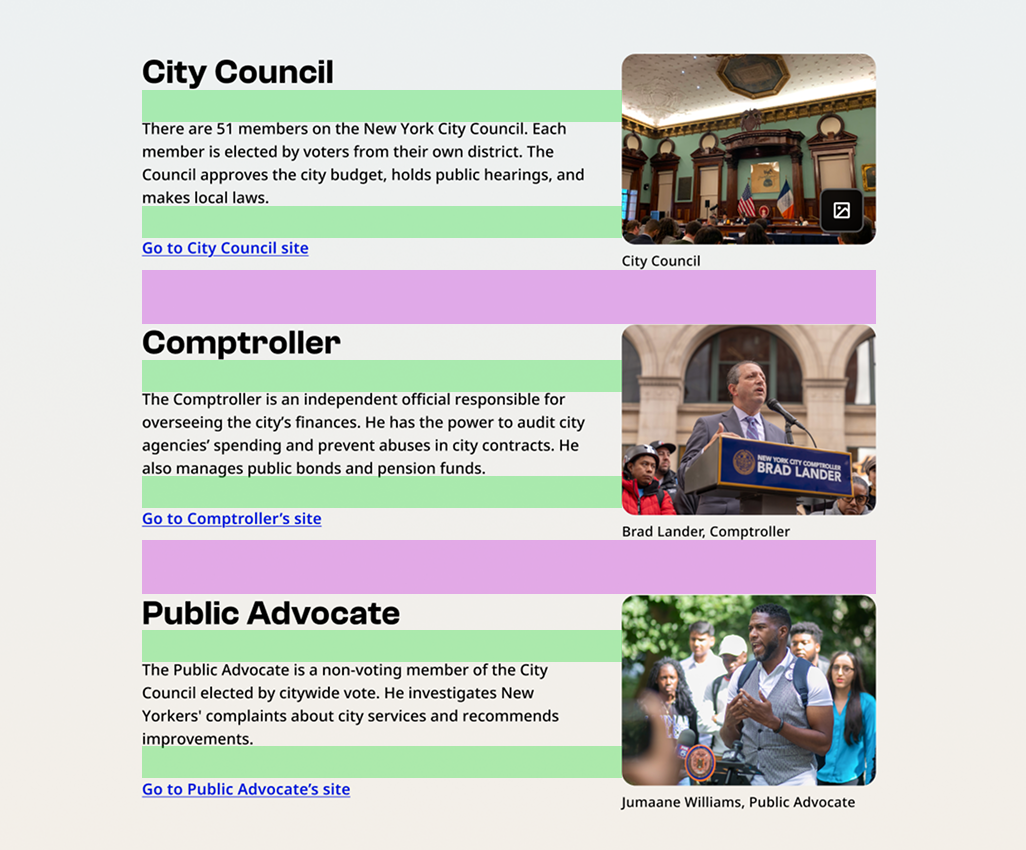
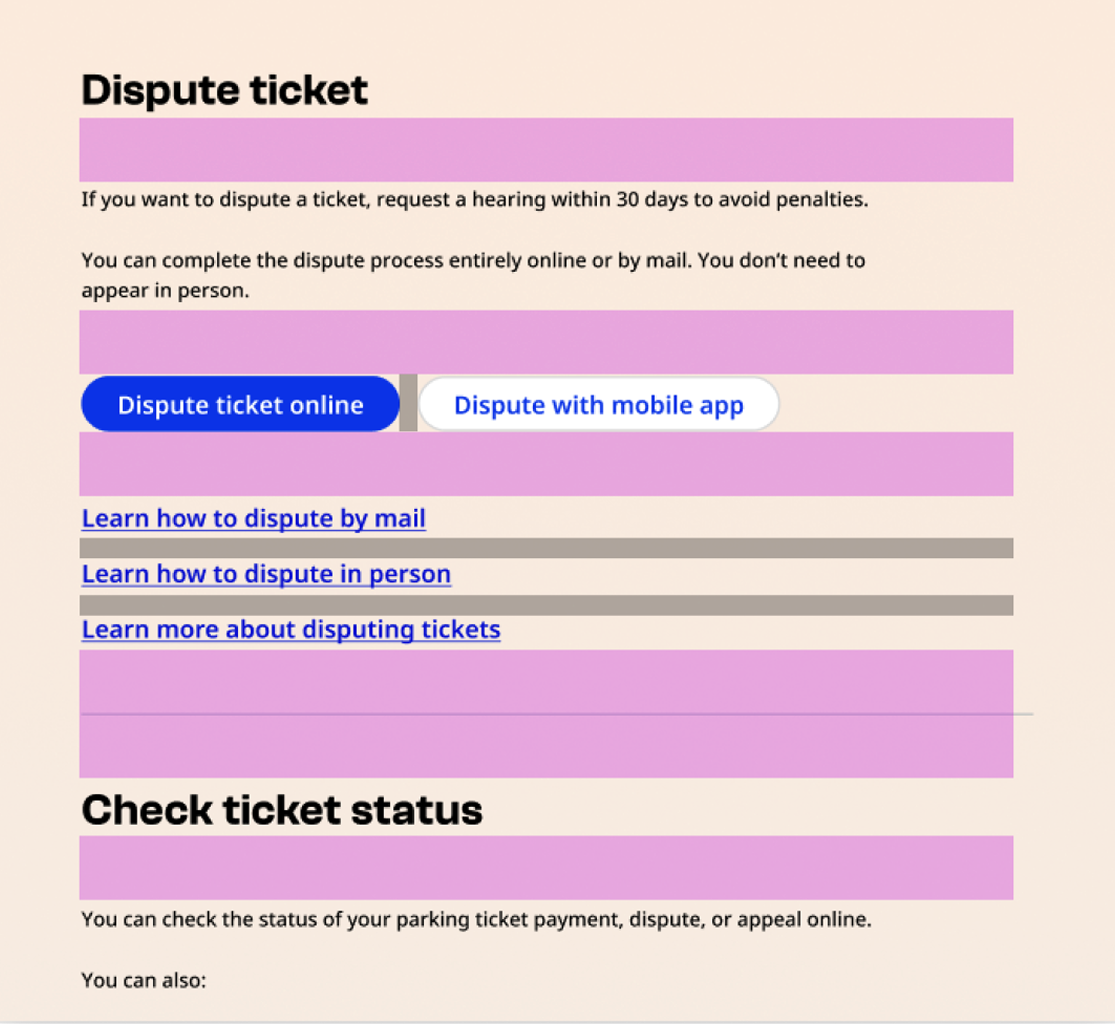
| 32 | Within a section, between H2 and any following content or subsections (such as H3, H4, body copy). |  |
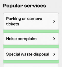
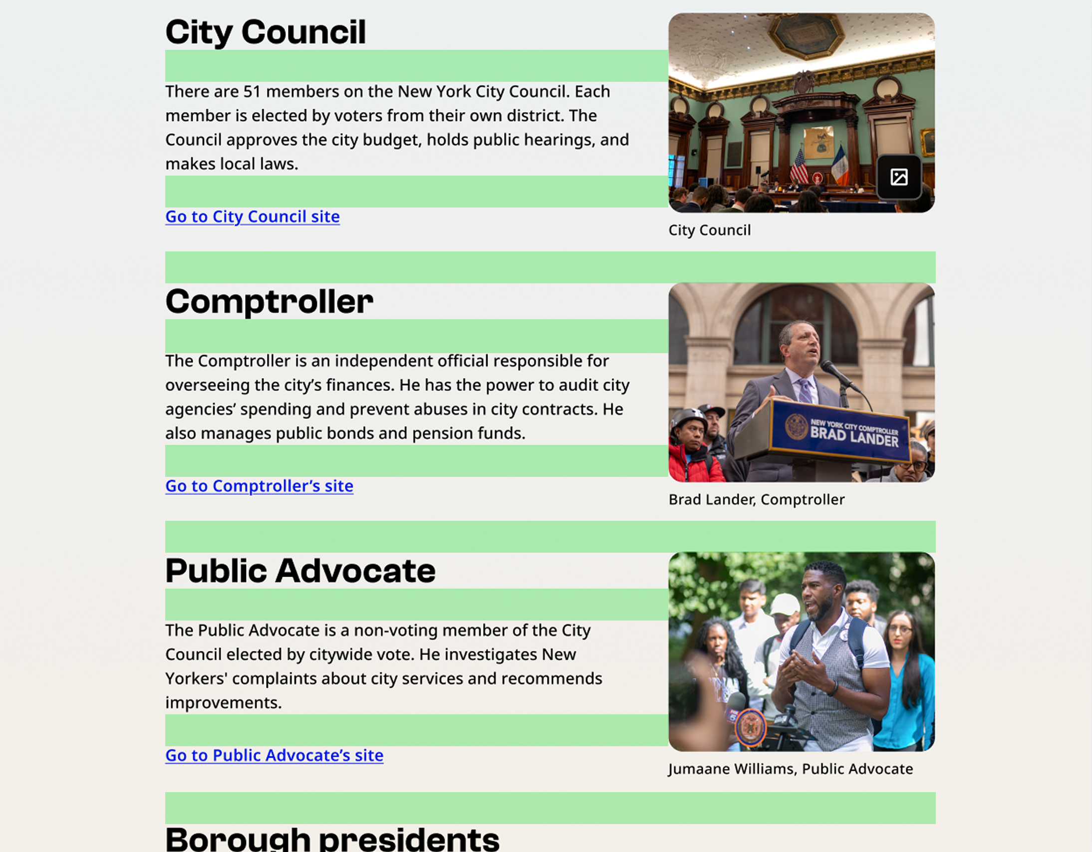
| 64 | Spacing between sections | 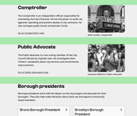 |
| Value (px) | Guidance | Example |
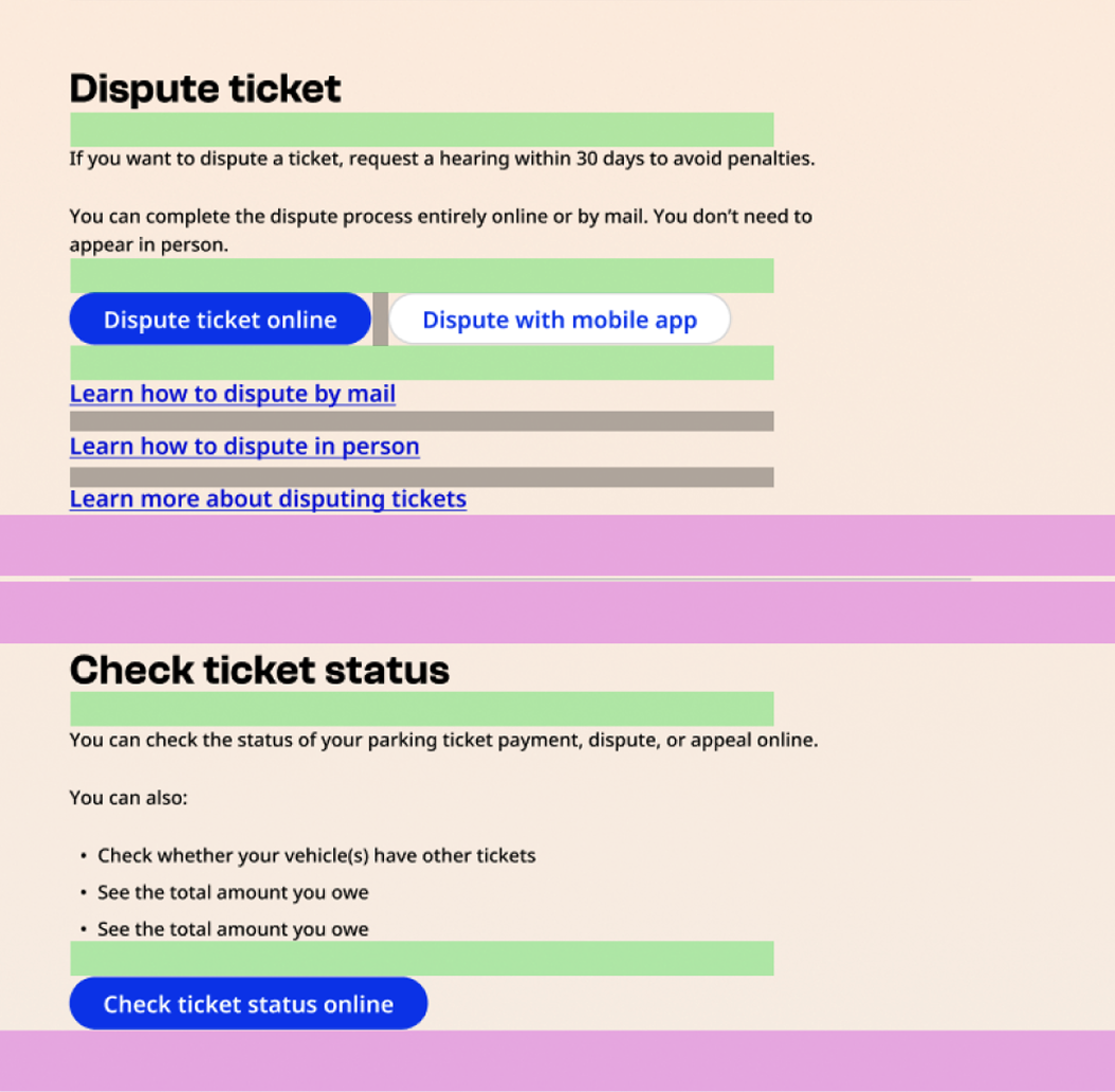
|---|---|---|
| 8 | Between a caption and its paired content (image or text), or between list items with icons |
|
| 16 | Within a section, between headings H3/H4 and the following text or components (such as buttons or standalone links) |
|
| 24 | Between components displayed in a list or grid |
|
| 32 | Within a section, between H2 and any following content or subsections (such as H3, H4, body copy). |
|
| 64 | Spacing between sections |
|