Radio button
A radio button allows users to select only one option from a number of choices.
Overview
Radio button
Radio buttons include a radio, label, and optional caption on a clickable surface.
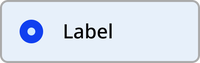
Default

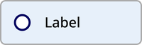
Hover
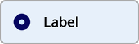
Focus
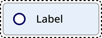

Disabled


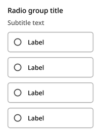
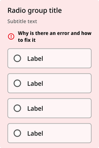
Radio button group
Radio buttons always appear in a group of two or more, accompanied by a title and optional subtitle.
Default
Error
Usage guidelines
Radio button labels should make it as clear as possible what the user is selecting. If you need to add more context, you may add supporting text.
Radio button
The radio button can be utilized with an nyc-field class container, with the following items:
- Label element: This acts as the button
- Radio input element: Contained within the label
<div class="code-examples">

  <div class="nyc-field">
    <legend>Default</legend>
    <label>
      <input type="radio" name="radio-default"/> Label
    </label>
  </div>

  <div class="nyc-field">
    <legend>Checked</legend>
    <label>
      <input type="radio" name="radio-checked" checked/> Label
    </label>
  </div>

  <div class="nyc-field">
    <legend>Disabled</legend>
    <label>
      <input type="radio" name="radio-disabled" disabled/> Label
    </label>
  </div>

  <div class="nyc-field">
    <legend>Disabled&Checked</legend>
    <label>
      <input type="radio" name="radio-disabled-checked" disabled checked/> Label
    </label>
  </div>

</div>
Radio button group
The Radio button group can be utilized with an nyc-field class container, with the following items:
- Legend element: This acts as the title for the group of radio buttons.
- Multiple Radio button components: As described above, but without individual
nyc-fieldcontainers - Error element (optional):
.error-message: Provides error messaging for the group. This should be placed after the legend and subtitle, and before the radio button elements. - Subtitle element (optional):
.subtitle: Provides additional context for the dropdown. This should be placed between the label and radio button elements.
Subtitle text
Subtitle text
Subtitle text
<div class="code-examples">

  <div class="nyc-field">
    <legend>Default</legend>
    <span class="subtitle">Subtitle text</span>
    <label>
      <input type="radio" name="default-group"/> Label 1
    </label>
    <label>
      <input type="radio" name="default-group"/> Label 2
    </label>
    <label>
      <input type="radio" name="default-group"/> Label 3
    </label>
  </div>

  <div class="nyc-field nyc-field--error">
    <legend>Error</legend>
    <span class="subtitle">Subtitle text</span>
    <div class="error-message"><i class="i-ph:warning-circle-bold"></i>This field is required.</div>
    <label>
      <input type="radio" name="error-group"/> Label 1
    </label>
    <label>
      <input type="radio" name="error-group"/> Label 2
    </label>
    <label>
      <input type="radio" name="error-group"/> Label 3
    </label>
  </div>

  <div class="nyc-field">
    <legend>Supporting Text</legend>
    <span class="subtitle">Subtitle text</span>
    <label>
      <input type="radio" name="supporting-text-group"/>
      <div>
        <span>Label 1</span>
        <span class="subtitle">Supporting text</span>
      </div>
    </label>
    <label>
      <input type="radio" name="supporting-text-group"/>
      <div>
        <span>Label 2</span>
        <span class="subtitle">Supporting text</span>
      </div>
    </label>
    <label>
      <input type="radio" name="supporting-text-group"/>
      <div>
        <span>Label 3</span>
        <span class="subtitle">Supporting text</span>
      </div>
    </label>
  </div>

</div>