Date input
The date input component allows users to type in a single date or date range. Date inputs are sometimes combined with calendars.
Overview
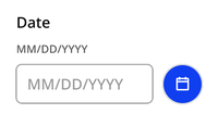
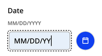
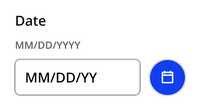
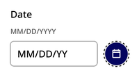
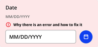
Single date
The single date variant allows only one date. It can be paired with an icon button that opens a calendar.
Default
Typing
Filled
Calendar opened
Error
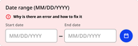
Date range
The date range variant allows users to enter a start and end date.
Default

Calendar opened

Error
Usage context
When to use
Use the date input component whenever you’re asking a user to input a date or date range.
For dates that are are no more than one year in the past or one year in the future, provide the calendar.
For dates that are likely to be more than one year in the past or future, such as date of birth for an adult, use only the date input component without a calendar.
When to use something else
When date options are limited or restricted to a certain timeframe, use a drop-down instead. For example, when selecting available times for an appointment.
Custom element
Use the nyc-date-input custom element to instantiate a date input
Single date
<nyc-date-input></nyc-date-input>Date range
<nyc-date-input date-range></nyc-date-input>