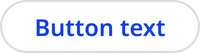
Button
Buttons encourage users to take an action. They use text or icons to communicate what will happen after the user engages with the button. They are one of two action components, along with links.
Overview
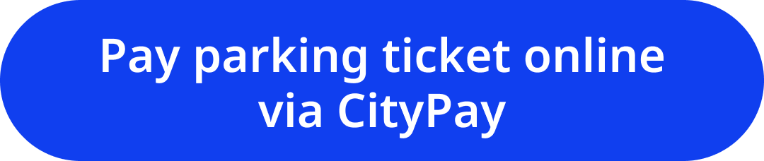
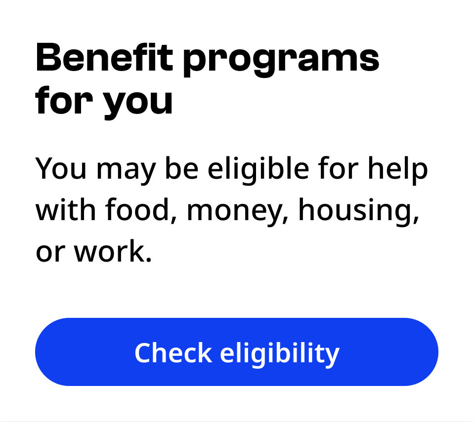
Primary button
Use the primary button for the action most users should take in a given content area.
Default

Hover

Focus

Disabled

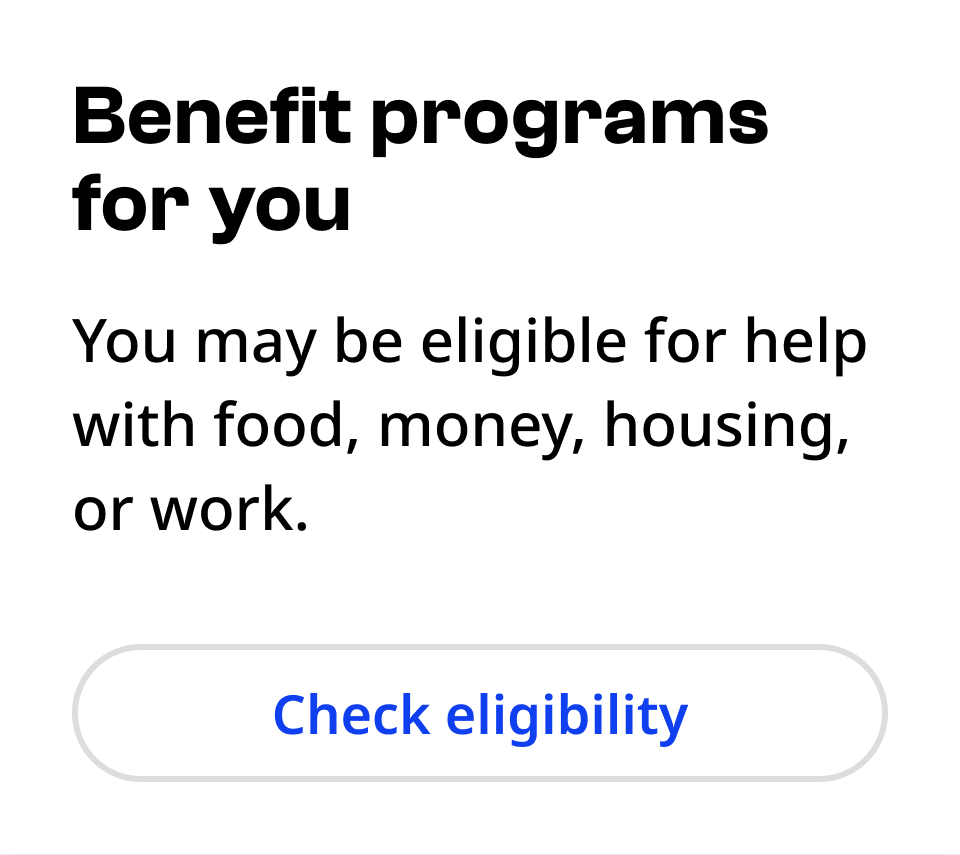
Secondary button
Use the secondary button for an action that is less common than the primary action.
Default
Hover

Focus

Disabled

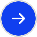
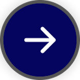
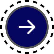
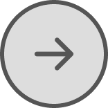
Icon button
Use icon buttons when there are severe space restrictions and an icon can effectively communicate the action.
Default
Hover
Focus
Disabled
Usage context
When to use
Only use buttons to encourage the user to take action online.
Examples of actions include:
- Beginning an online transaction
- Submitting information
- Accessing an application
- Applying changes in a menu
- Viewing a specific piece of information
When to use something else
Don’t use a button for these purposes:
- For the action of navigating to a website or a webpage (use a link instead).
- For actions that can’t be completed online, such as contacting an office by mail (use a link to the page containing instructions or write them clearly on the page)
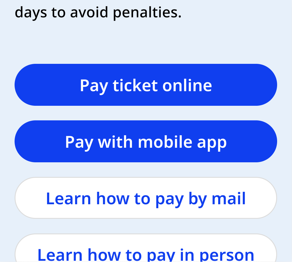
- For content areas with more than two actions, use links for any action beyond the second (after the primary and secondary buttons).
Usage guidelines
Primary and secondary buttons
Button text should be short enough to fit on one line at the button’s maximum width. Button text may wrap onto two lines on smaller displays. If your text is still wrapping at maximum width, shorten it or use a link instead.

Only use up to one primary and one secondary button in any content area. Use links for further actions.
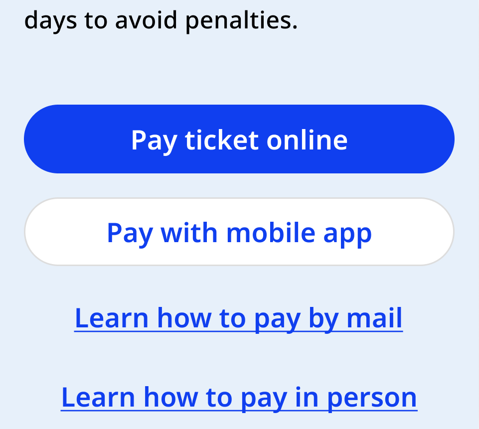
Primary buttons can stand alone. Secondary buttons must accompany a primary button.
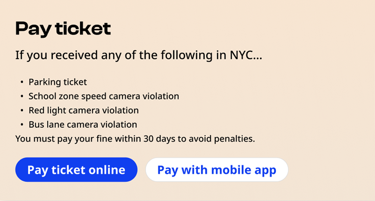
Button group
Button groups contain one primary and one secondary action.
In vertical layouts, the primary button is always closest to the top.
In horizontal layouts, the primary and secondary actions can be placed vertically or side-by-side. Use discretion to determine which arrangement will be most natural to users in context. The action of applying changes or submitting a form is typically in the bottom right.
Primary button
The primary button can be utilized with a button or a element, with the following:
- Class:
nyc-button - Attribute:
data-variant="primary"
<div class="code-examples">
  <button class="nyc-button">Default</button>
  <button class="nyc-button" data-variant="primary" disabled>Disabled</button>
  <a href="#" class="nyc-button" data-variant="primary">Link button</a>
</div>
Secondary button
The secondary button can be utilized with a button or a element, with the following:
- Class:
nyc-button - Attribute:
data-variant="secondary"
<div class="code-examples">
  <button class="nyc-button" data-variant="secondary">Default</button>
  <button class="nyc-button" data-variant="secondary" disabled>Disabled</button>
  <a href="#" class="nyc-button" data-variant="secondary">Link button</a>
</div>
Icon button
The icon button can be utilized with a button or a element, with the following attributes:
- Class:
nyc-button - Attribute:
data-variant="icon" - Icon element: An icon element should be placed inside the button or link, using an icon font class enabled in the icons package (The package draws from the Iconify: Phosphor Iconset).
<div class="code-examples">
  <div>
    <h4>Default</h4>
    <button type="button" class="nyc-button" data-variant="icon" aria-label="Next"><i class="i-ph:caret-right-bold"></i></button>
  </div>
  <div>
    <h4>Disabled</h4>
    <button type="button" class="nyc-button" data-variant="icon" aria-label="Next" disabled><i class="i-ph:caret-right-bold"></i></button>
  </div>
  <div>
    <h4>Link Button</h4>
    <a href="#" class="nyc-button" data-variant="icon" aria-label="Next"><i class="i-ph:caret-right-bold"></i></a>
  </div>
</div>