Combo-box
The combo-box allows users to choose one option from a list of more than 15 items. It’s called a combo-box because it enables both typing and scrolling to find the correct option. For smaller lists, use drop-down select.
Overview
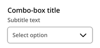
The component contains a title, optional subtitle, and drop-down container with up to 15 options.
Default
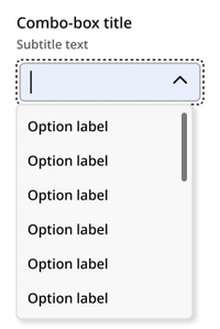
Opened
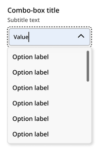
Typing
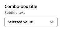
Selected
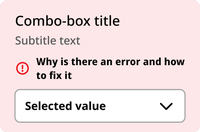
Error
Disabled

Usage context
When to use
Use the combo-box component when the user is being asked to select just one item from a list of more than 15 items.
When to use something else
Don’t use the combo-box component in the following situations:
- When the user is being asked to select one of a list of 15 or fewer options (use a drop-down select or radio buttons instead)
- When the user is being asked to select more than one option from a list (use checkboxes instead)
Combo-box
The combo-box component can be utilized with an nyc-field class container, with the following items:
- Label element: This acts as the button
- Subtitle element (optional):
.subtitle: Provides additional context for the combo-box. This should be placed between the label and select elements. - NYC Combo-box element:
<nyc-combo-box>: This is the custom element that provides the combo-box functionality. - This element requires the following:
- an id attribute and
- a list of option elements with value attributes (as you would include in a select element options).
- The combo-box element will automatically generate the following:
- Text input: For search/filter of options
- Options list element:
<nyc-combo-box-list>: The list options will be added to this list aslielements
This code is for reference only. The library is currently in beta. Check back for future releases.
<form class="code-examples">

  <div class="nyc-field">
    <label for="example-default-combo-box">Default Combo-box Label</label>
    <span class="subtitle">Subtitle text</span>
    <nyc-combo-box id="example-default-combo-box">
      <option value="alabama">Alabama</option>
      <option value="alaska">Alaska</option>
      <option value="arizona">Arizona</option>
      <option value="arkansas">Arkansas</option>
      <option value="california">California</option>
      <option value="colorado">Colorado</option>
      <option value="connecticut">Connecticut</option>
      <option value="delaware">Delaware</option>
      <option value="florida">Florida</option>
      <option value="georgia">Georgia</option>
      <option value="hawaii">Hawaii</option>
      <option value="idaho">Idaho</option>
      <option value="illinois">Illinois</option>
      <option value="indiana">Indiana</option>
      <option value="iowa">Iowa</option>
      <option value="kansas">Kansas</option>
      <option value="kentucky">Kentucky</option>
      <option value="louisiana">Louisiana</option>
      <option value="maine">Maine</option>
      <option value="maryland">Maryland</option>
      <option value="massachusetts">Massachusetts</option>
      <option value="michigan">Michigan</option>
      <option value="minnesota">Minnesota</option>
      <option value="mississippi">Mississippi</option>
      <option value="missouri">Missouri</option>
      <option value="montana">Montana</option>
      <option value="nebraska">Nebraska</option>
      <option value="nevada">Nevada</option>
      <option value="new_hampshire">New Hampshire</option>
      <option value="new_jersey">New Jersey</option>
      <option value="new_mexico">New Mexico</option>
      <option value="new_york">New York</option>
      <option value="north_carolina">North Carolina</option>
      <option value="north_dakota">North Dakota</option>
      <option value="ohio">Ohio</option>
      <option value="oklahoma">Oklahoma</option>
      <option value="oregon">Oregon</option>
      <option value="pennsylvania">Pennsylvania</option>
      <option value="rhode_island">Rhode Island</option>
      <option value="south_carolina">South Carolina</option>
      <option value="south_dakota">South Dakota</option>
      <option value="tennessee">Tennessee</option>
      <option value="texas">Texas</option>
      <option value="utah">Utah</option>
      <option value="vermont">Vermont</option>
      <option value="virginia">Virginia</option>
      <option value="washington">Washington</option>
      <option value="west_virginia">West Virginia</option>
      <option value="wisconsin">Wisconsin</option>
      <option value="wyoming">Wyoming</option>
    </nyc-combo-box>
  </div>

  <div class="nyc-field nyc-field--error">
    <label for="example-error-select">Error Combo-box Label</label>
    <span class="subtitle">Subtitle text</span>
    <div class="error-message"><i class="i-ph:warning-circle-bold"></i>This field is required.</div>
    <nyc-combo-box>
      <option value="1">Option 1</option>
      <option value="2">Option 2</option>
      <option value="3">Option 3</option>
    </nyc-combo-box>
  </div>

  <div class="nyc-field">
    <label for="example-disabled-select">Disabled Combo-box Label</label>
    <span class="subtitle">Subtitle text</span>
    <nyc-combo-box id="example-disabled-combo-box" disabled>
      <option value="">-- Disabled --</option>
    </nyc-combo-box>
  </div>

</form>