Text input
Text input allows a user to write or edit short amounts of text.
Overview
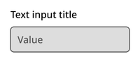
The text input component consists of a title, optional subtitle, and text container.
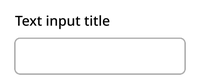
Default
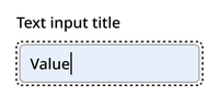
Typing
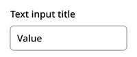
Filled
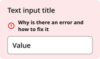
Error
Disabled
Usage context
When to use
Use text inputs for capturing text that can fit on one line in any form or interface.
When to use something else
Don’t use text input in the following scenarios:
- Date selectors (use a date input instead)
- Text that will stretch to more than one line (use the text area component instead)
- Displaying text that the user cannot edit
Text input
The text input can be utilized with an nyc-field class container, with the following items:
- Label element: This acts as the button
- Text input element: After the label
- Error element (optional):
.error-message: Provides error messaging for the input. This should be placed after the label and before the input element.
<div class="code-examples">
  <div class="nyc-field">
    <label for="default-input">Default Input Label</label>
    <input id="default-input" type="text" />
  </div>

  <div class="nyc-field nyc-field--error">
    <label for="error-input">Error Input Label</label>
    <div class="error-message"><i class="i-ph:warning-circle-bold"></i>This field is required.</div>
    <input id="error-input" type="text" aria-invalid="true" value="" />
  </div>

  <div class="nyc-field">
    <label for="disabled-input">Disabled Input Label</label>
    <input id="disabled-input" type="text" value="Unchangeable value" disabled />
  </div>
</div>