Back to top
Back to top is a button that helps users navigate back to the top of long pages. It’s usually paired with jump links.
Overview
The back to top button only appears on pages that are four times taller than the viewport height. It has different behavior on desktop and mobile devices.
Desktop
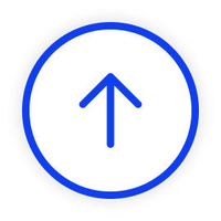
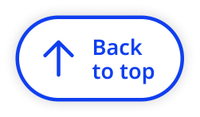
On desktop, the back to top button appears as a sticky icon button when the user scrolls below the fold (1x viewport height). The back to top text is revealed on hover.
Default
Hover
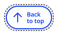
Focus
Mobile
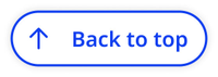
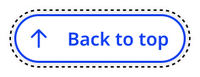
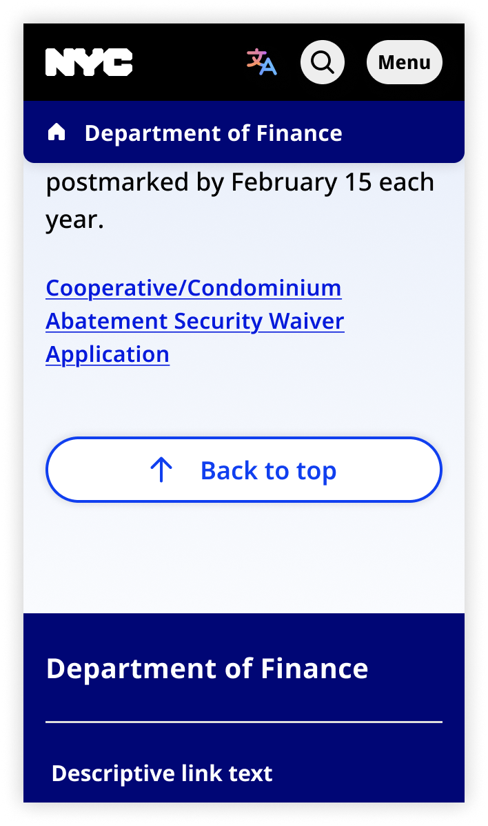
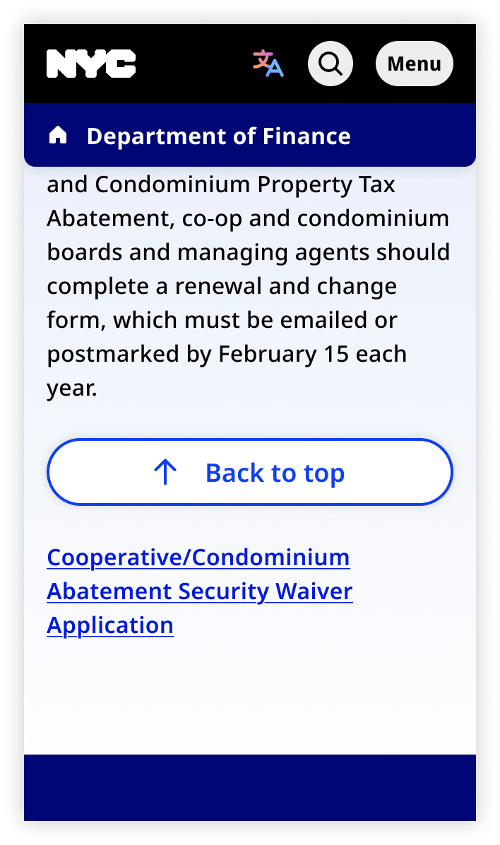
On mobile, the back to top button is not sticky. It's positioned below the page content and above the footer. The back to top text is always visible.
Default
Focus
Usage context
When to use
Use back to top whenever you use jump links.
You may also use back to top on any long page.
When to use something else
Don’t use back to top on short pages.
Usage guidelines
On mobile, place the back to top button at the bottom of the page (below the content and above the footer). It is not sticky or floating.
Back to top
The Back to top button can be invoked via the nyc-back-to-top custom element. This custom element will automatically calculate when to render the button based on page length and scroll position.
This code is for reference only. The library is currently in beta. Check back for future releases.
<nyc-back-to-top>
  <button id="back-to-top" class="nyc-button" data-variant="back-to-top" aria-label="Back to top">
    <span>Back to top</span>
  </button>
</nyc-back-to-top>
Custom Element
To utilize the nyc-back-to-top Custom Element, you must import it into your Javascript and run the class's define function
import { NYCBackToTop } from '@nycds/core'

NYCBackToTop.define()