Official website. How you know

Official websites use .gov

A .gov website belongs to an official government organization in the United States.

Secure .gov websites use HTTPS

A lock or https:// means you’ve safely connected to the .gov website. Share sensitive information only on official, secure websites.

Digital Design System

Calendar

Calendars are modals for users to pick single dates, or the start and end of a date range. They are often used with date input.

Overview

There are two calendar variants: single date and date range. 

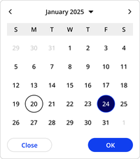
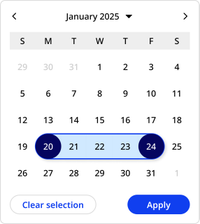
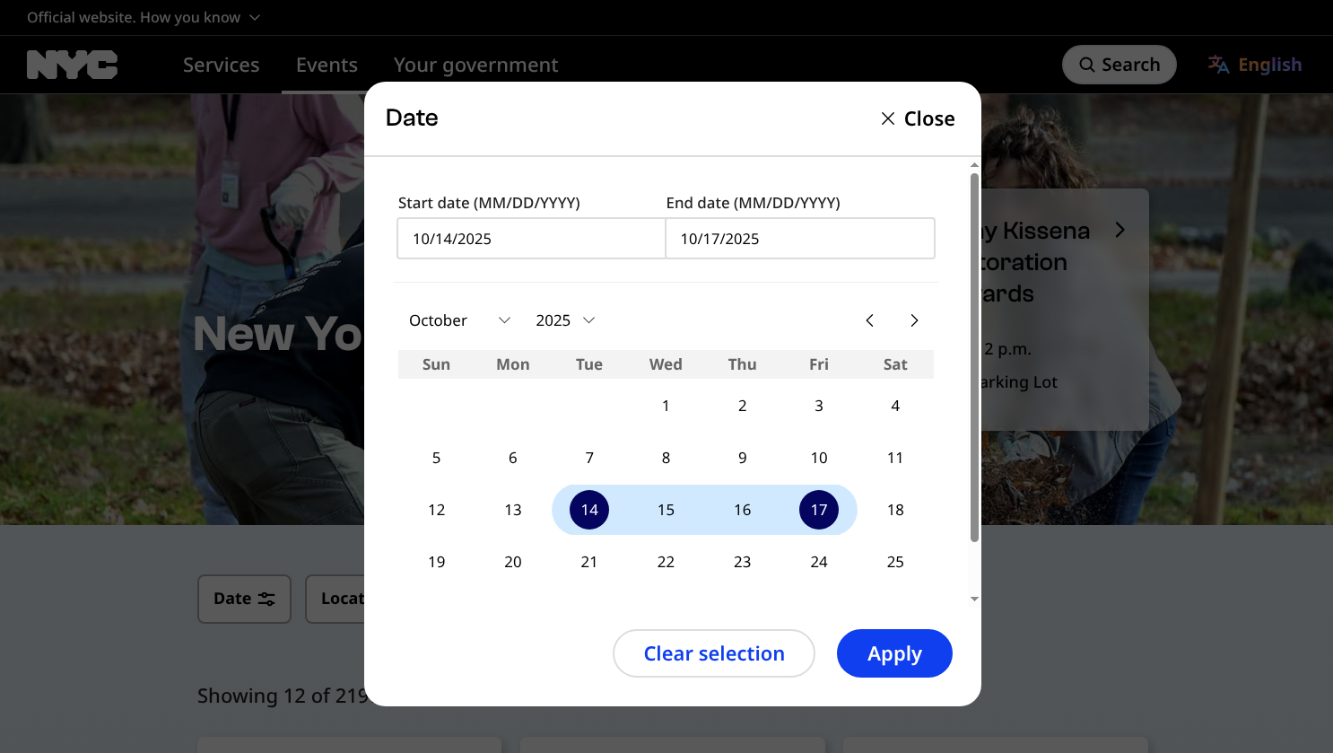
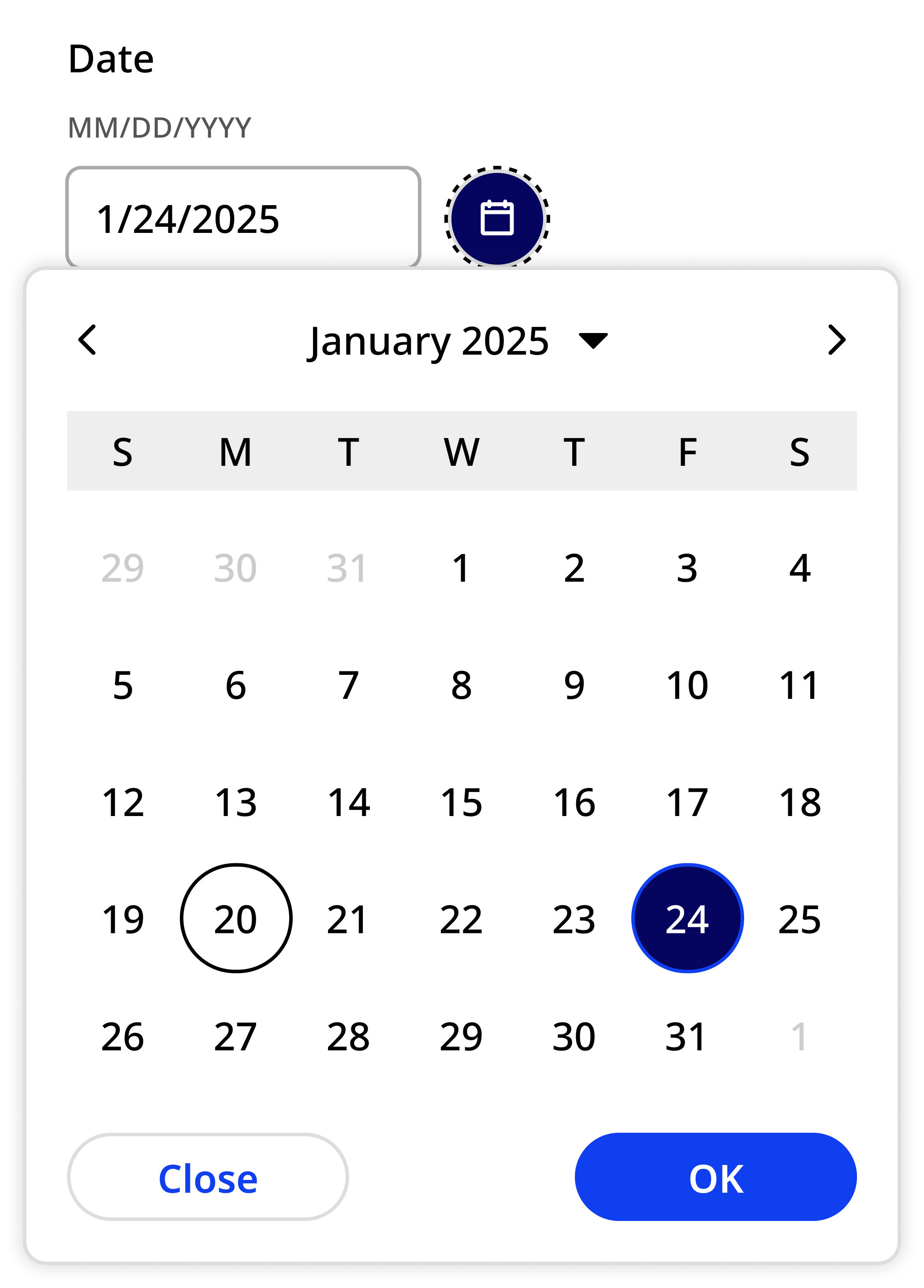
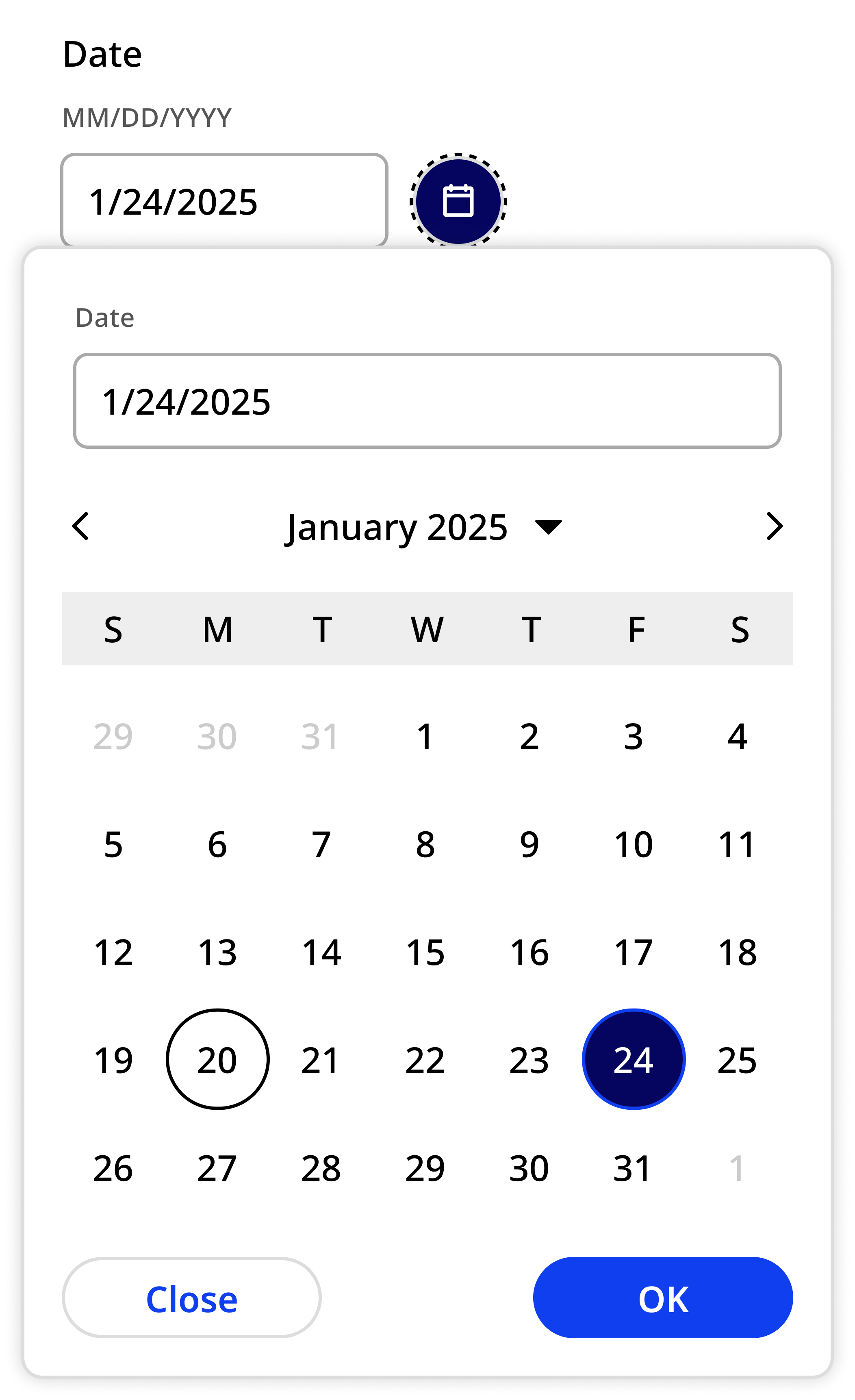
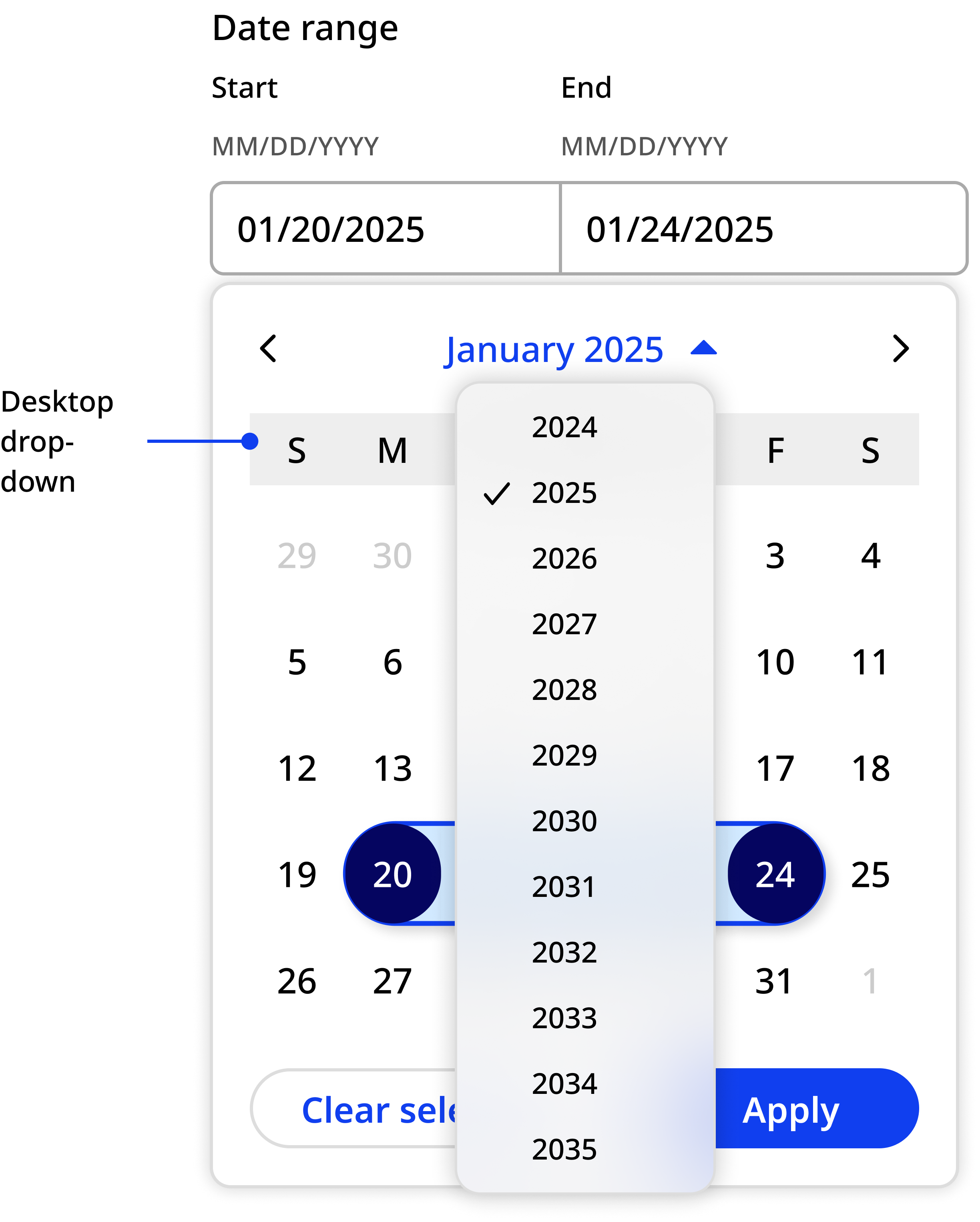
In both variants, the current date is marked with a circle. The user can use arrows to navigate months, or manually select month and year using drop-downs. 

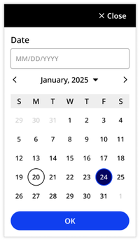
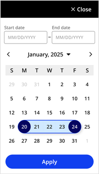
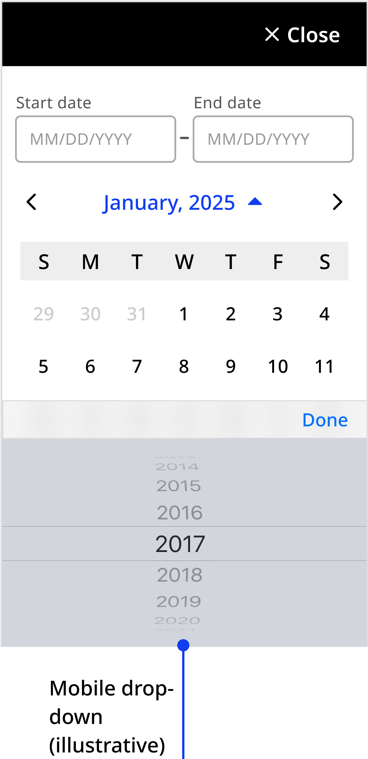
On mobile, the component is a full-screen interaction.

Single date

Desktop

January 2025 is displayed with a previous, next and dropdown to change the month/year, days of the week are labeled: S, M, T, W, T, F, S.  Dates are shown in a grid with the 20th circled with just a black outline and the 24th has a solid dark blue circle and the number inverted to white. Below the calendar grid there is a Close secondary button and OK primary button.

Mobile

Differences include a button labeled Close with an X icon in the top right corner, a date input component at the top beneath the title 'Date' and below the same calendar grid a single OK primary button.

Date range

Desktop

20th and 24th are now both solid dark blue circle and the number inverted to white, the dates between have a light blue background and an outline of blue connecting the two circles, additionally the buttons have changed to be Clear selection secondary button and Apply primary button.

Mobile

Same date selection visual from the desktop, and similar single date mobile controls of close at the top, but with Start date and End date inputs and the button at the bottom is Apply rather than OK

Usage context

When to use

Use calendars to let users select single dates or date ranges that are no more than one year in the past or one year in the future.


When to use something else

For dates that are likely to be more than one year in the past or future, such as date of birth for an adult, use only the date input component without a calendar.

Usage guidelines

When date selection is in a filter, include both the date input and calendar components in the filtering modal.

In all other contexts, the calendar should be hidden unless opened by the user.

Desktop view of the Date dialog on-top of a greyed-out page, October 14th 2025 to October 17 is selected

On desktop, when calendar is opened from the date input component, toggle the date input component within the calendar to off. This ensures the user doesn’t see two duplicate date inputs.

nyc.gov screenshot showing the correct usage of the calendar component. A date input field is visible on the page with a selected button containing a calendar icon. The calendar component modal drops down from the selected button. Because the date input component is visible on the page, it is excluded from the modal.

Date input field is visible on the page and within the open single selection calendar component modal.

When using the month and year drop-downs, default to the device or browser’s native drop-down elements.

  • Desktop view of date range with Year drop down expanded
  • Mobile view of the date range with iOS native year picker wheel is at the bottom of the display

Custom element

Use the nyc-calendar custom element to instantiate a calendar

This code is for reference only. The library is currently in beta. Check back for future releases.
<nyc-calendar></nyc-calendar>